The Problem
CRM System Was Bloated Causing Decreased Company Productivity
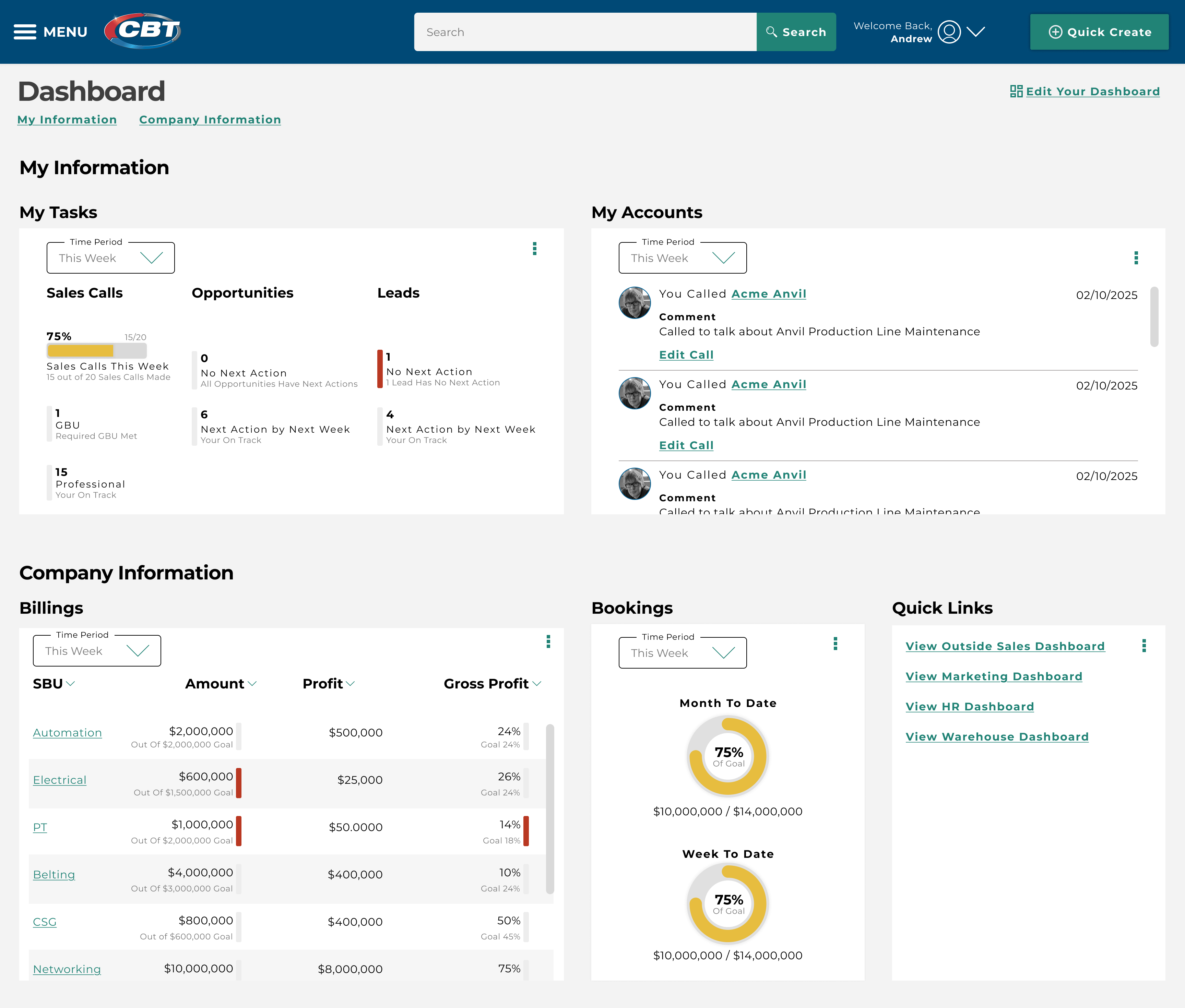
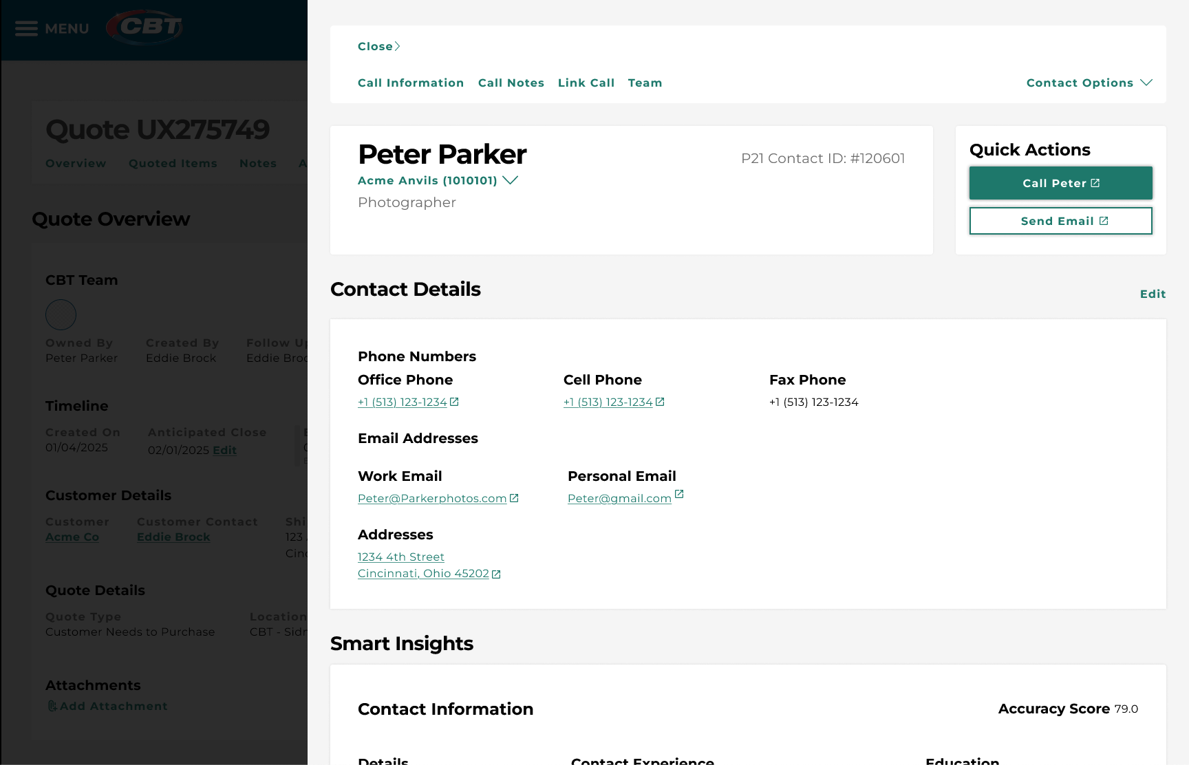
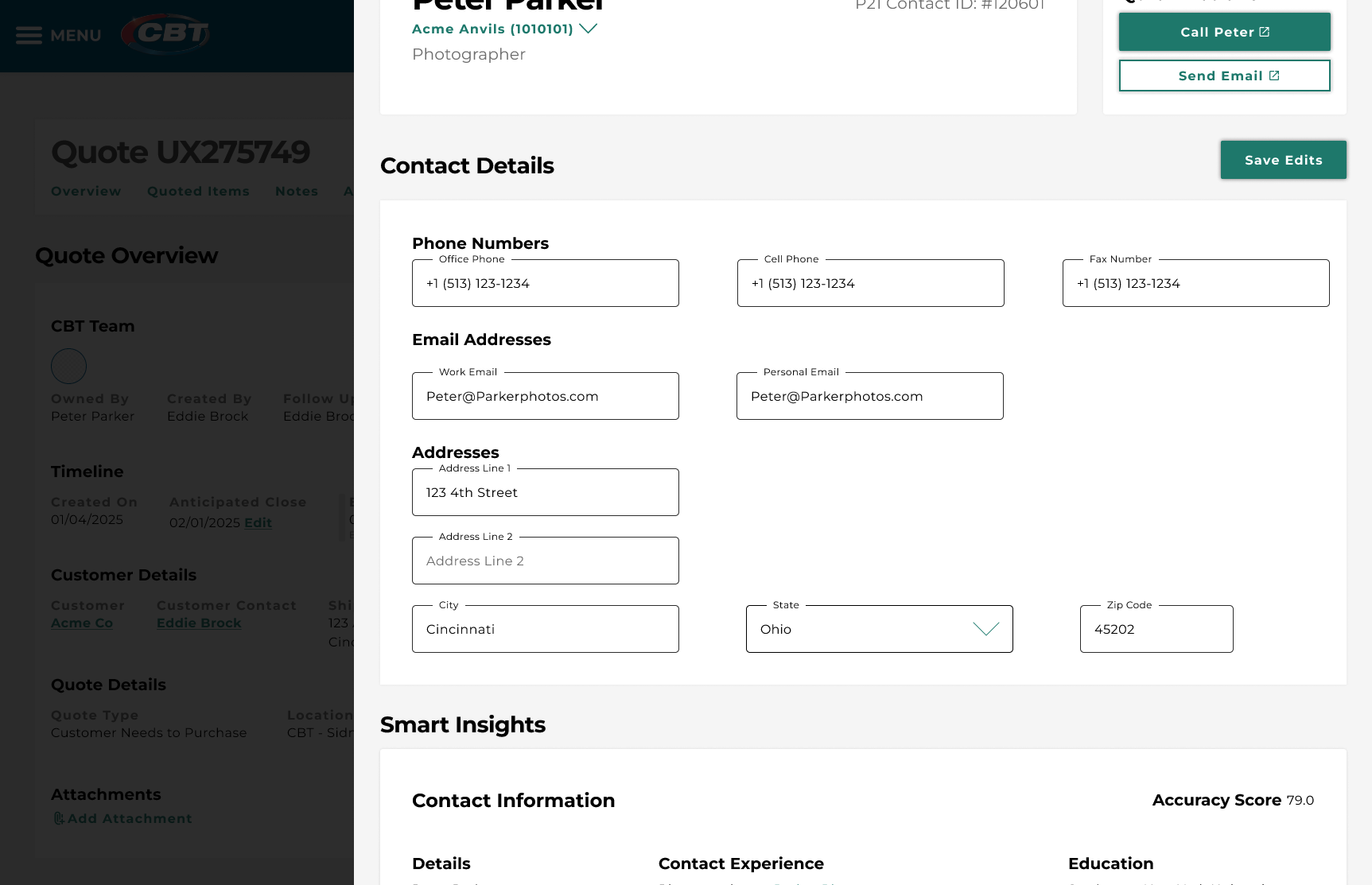
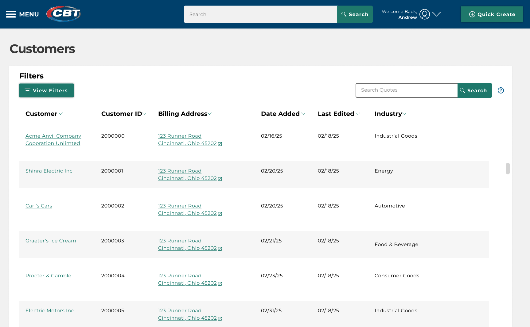
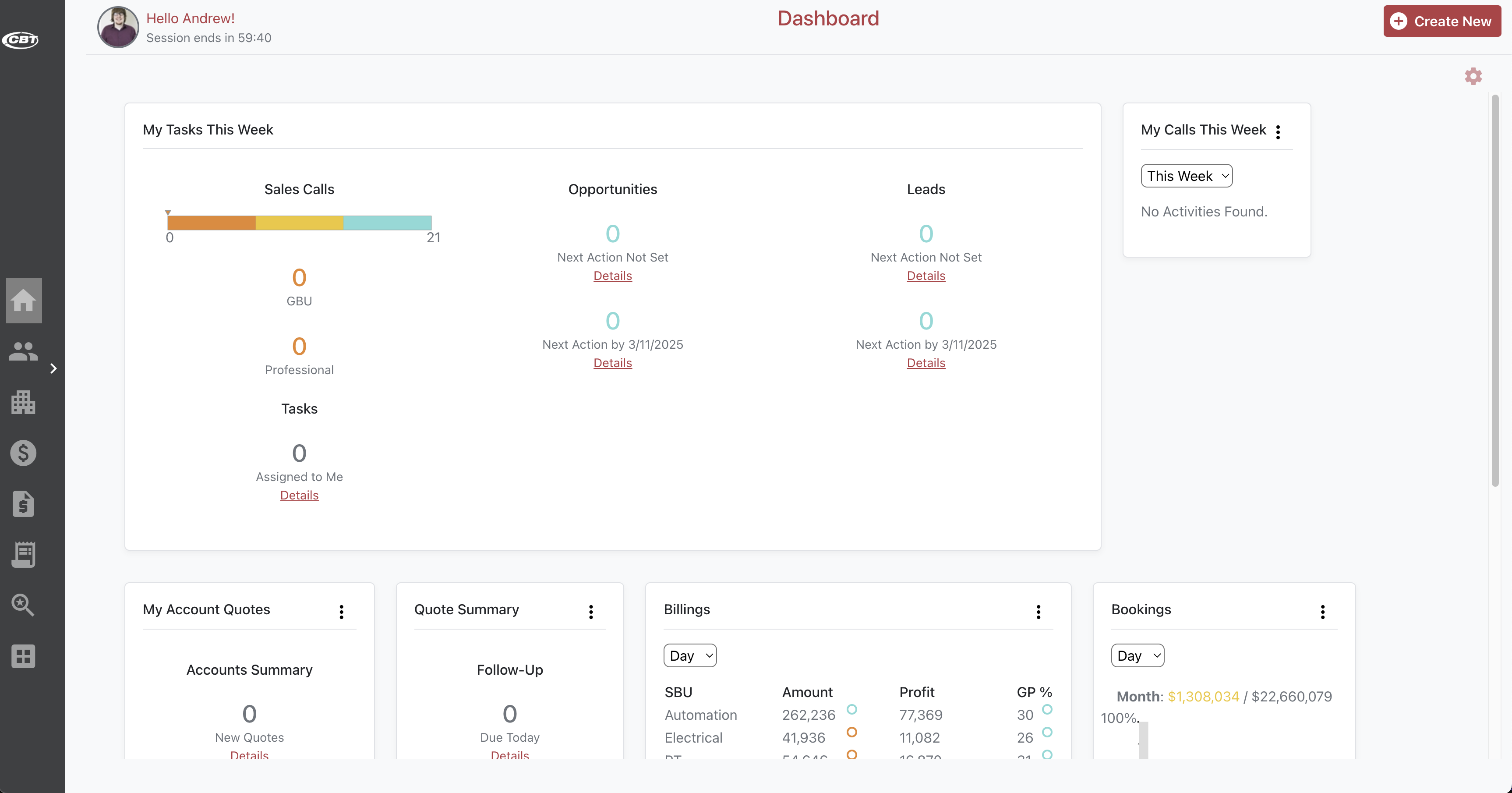
CBT had an in-house built CRM system that was core to business operations, managing all customer, contact, and quote information. Users complained about its complexity and the amount of context switching required. As a result, an initiative was launched to quickly update the system within four months, which meant limiting the research & design process to one month.
 Previous Design
Key Issues
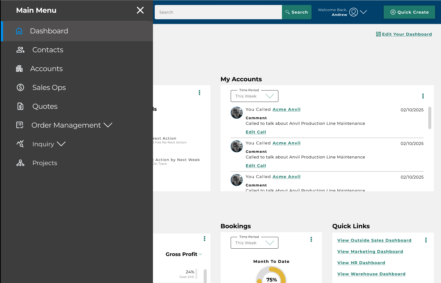
Context Switching
Users frequently complained about having to switch sections within the platform, which disrupted workflow.
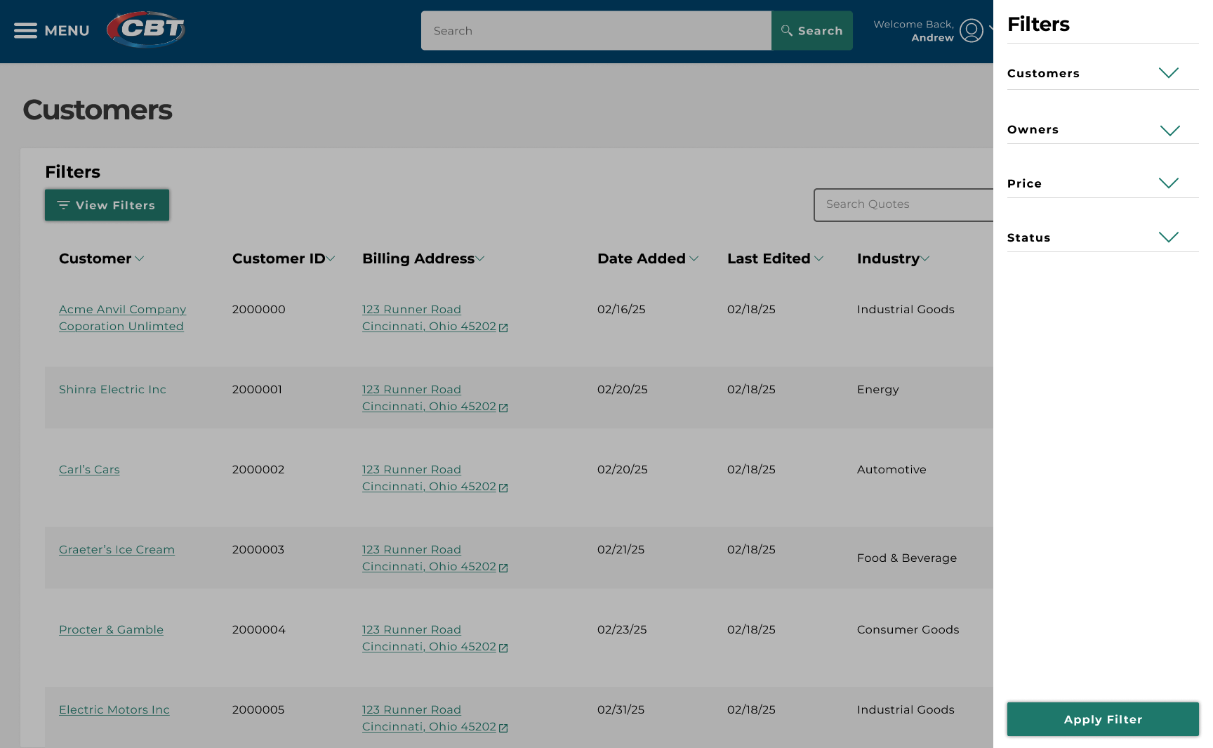
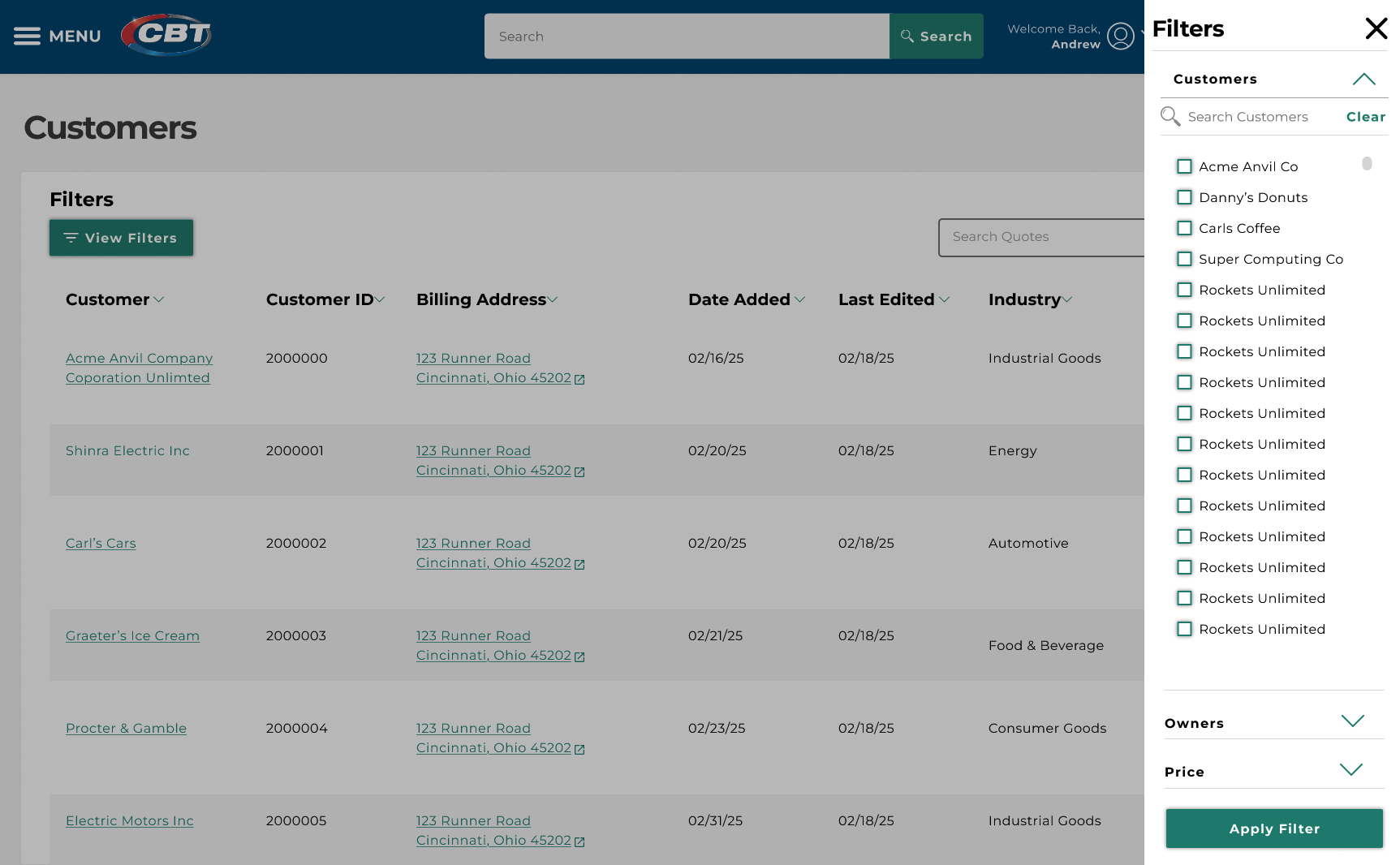
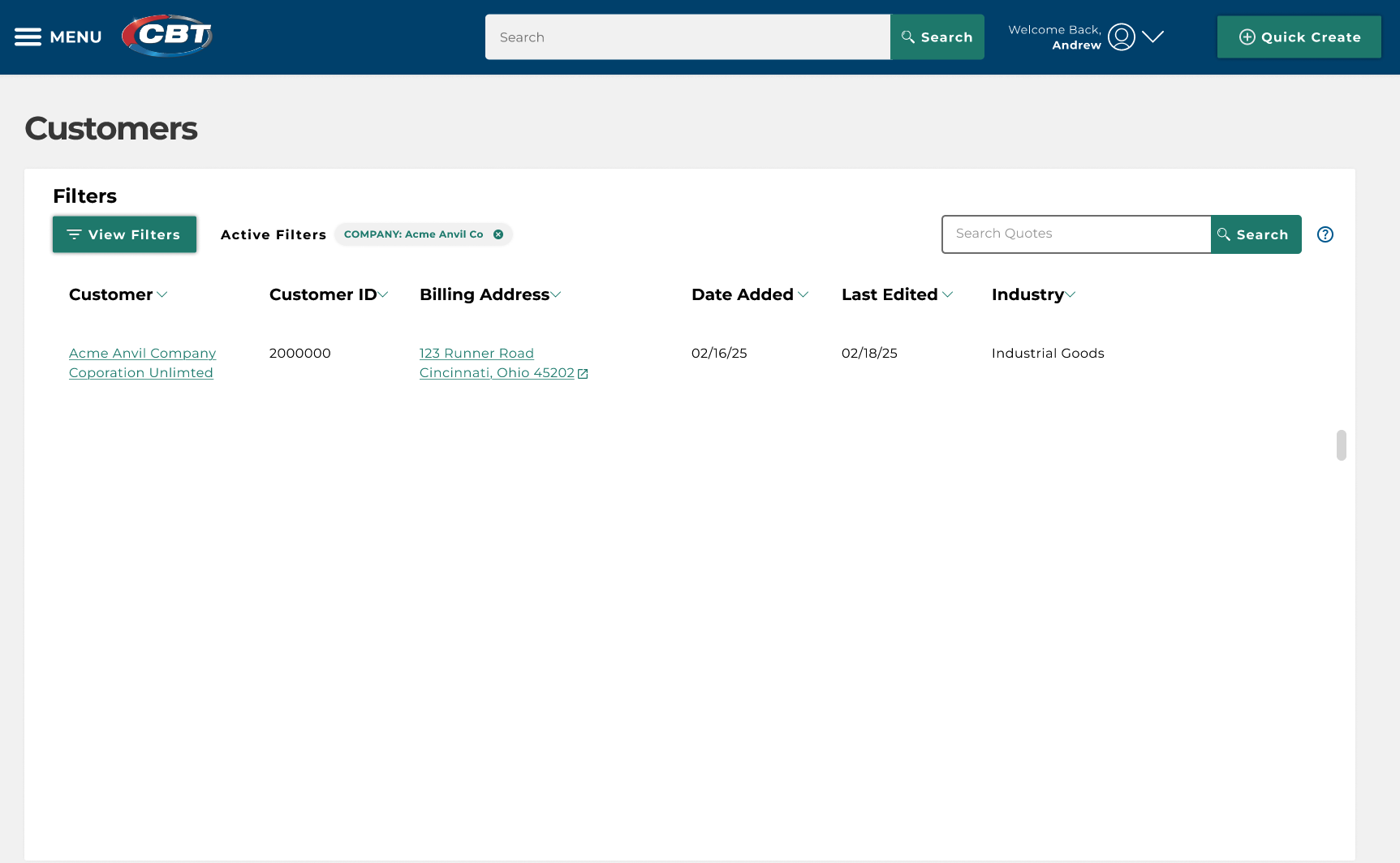
Finding Information
During user interviews, a recurring frustration was the time it took to access information. Most users were unaware of the system’s search function and found the filtering process clunky.
Not Inline With Company Design System
CRMgo was originally developed before the company design system existed. As a result it needed to be brought inline with the system to streamline maintenance, updates, and make it cohesive with the rest of CBT's digital platforms.
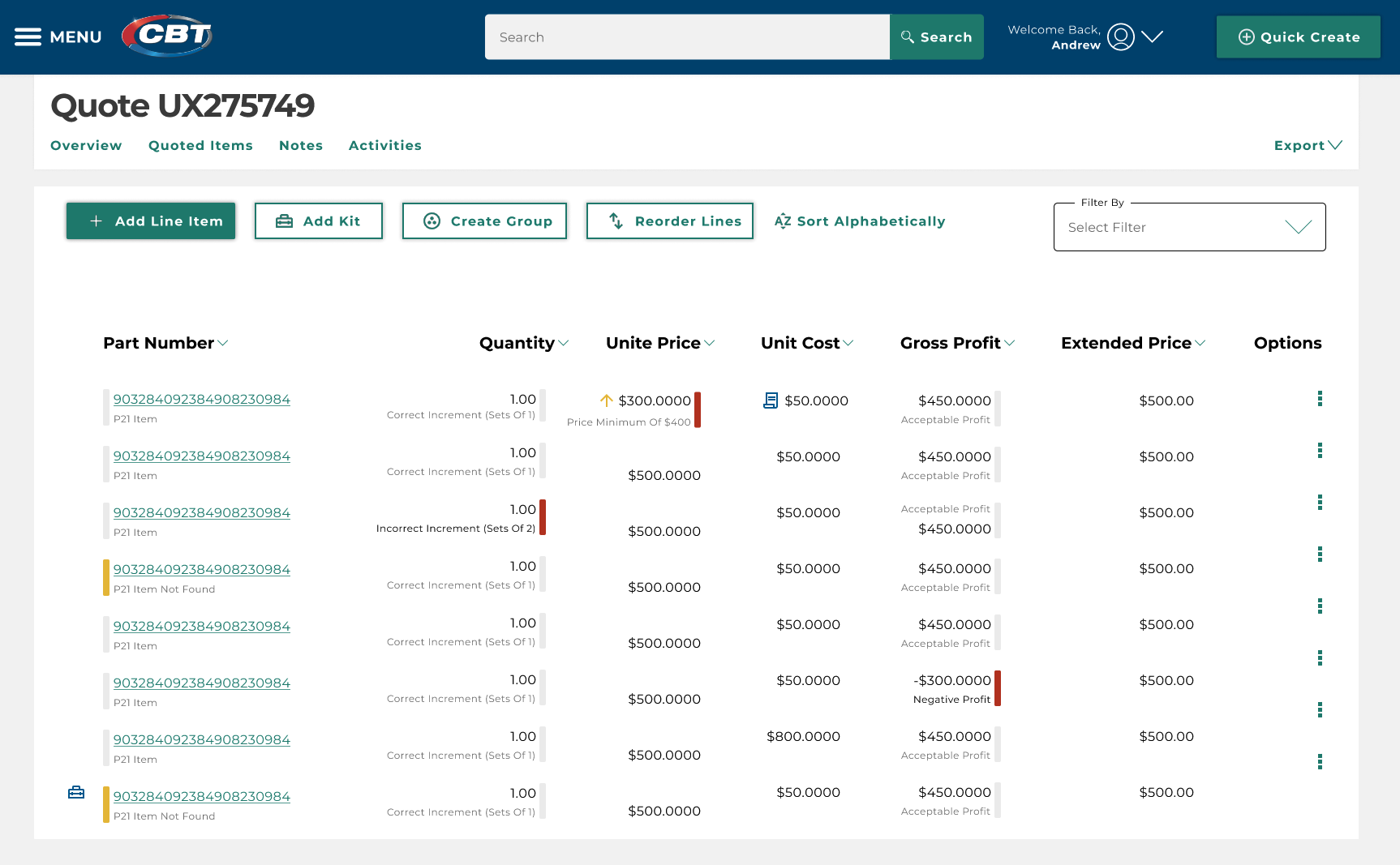
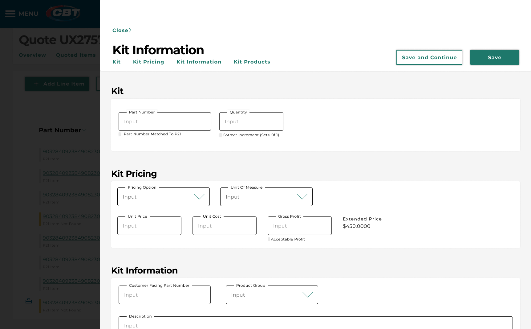
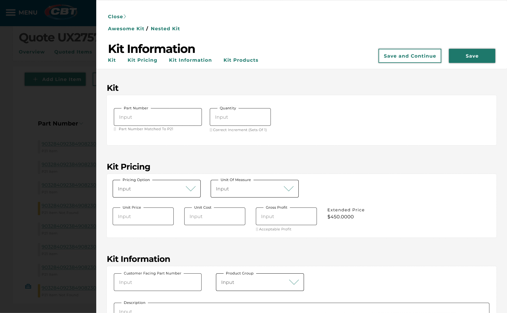
Kit Creation Complex and Frustrating
Kits are bundles of products sold at a grouped price, and they are central to the company’s quoting process. The existing workflow required a lot of training, and even after being trained, users still struggled with it.